IELTSのサンプル解答です。筆者はIELTSライティングで7.0以上の取得を目指して勉強しています。今回はTask 1エッセイの2回目です。Task 1は、棒グラフや線グラフ、円グラフなどの図が問題に出され、そこに記載されている情報を客観的にレポートするものです。Task 1はTask 2よりも点数配分が低いものの、軽視することはできません。また、Task 2に集中するためにも、Task 1に長い時間を取られないように、書き方の型を身に着けると良いと考えています。
Topic Question
※この問題は過去に出た問題に基づいて、独自に作成されたものです。手作りのためグラフに見づらい部分がありますが、ご了承ください。
筆者の解答例
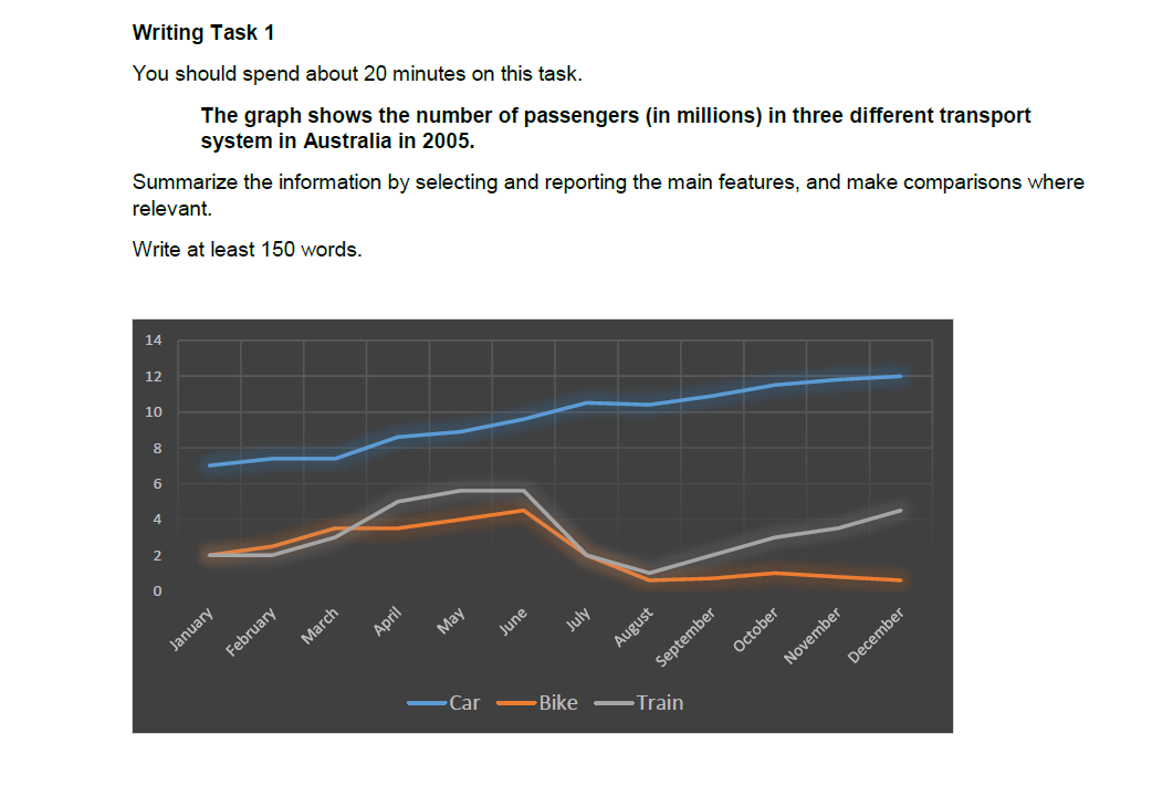
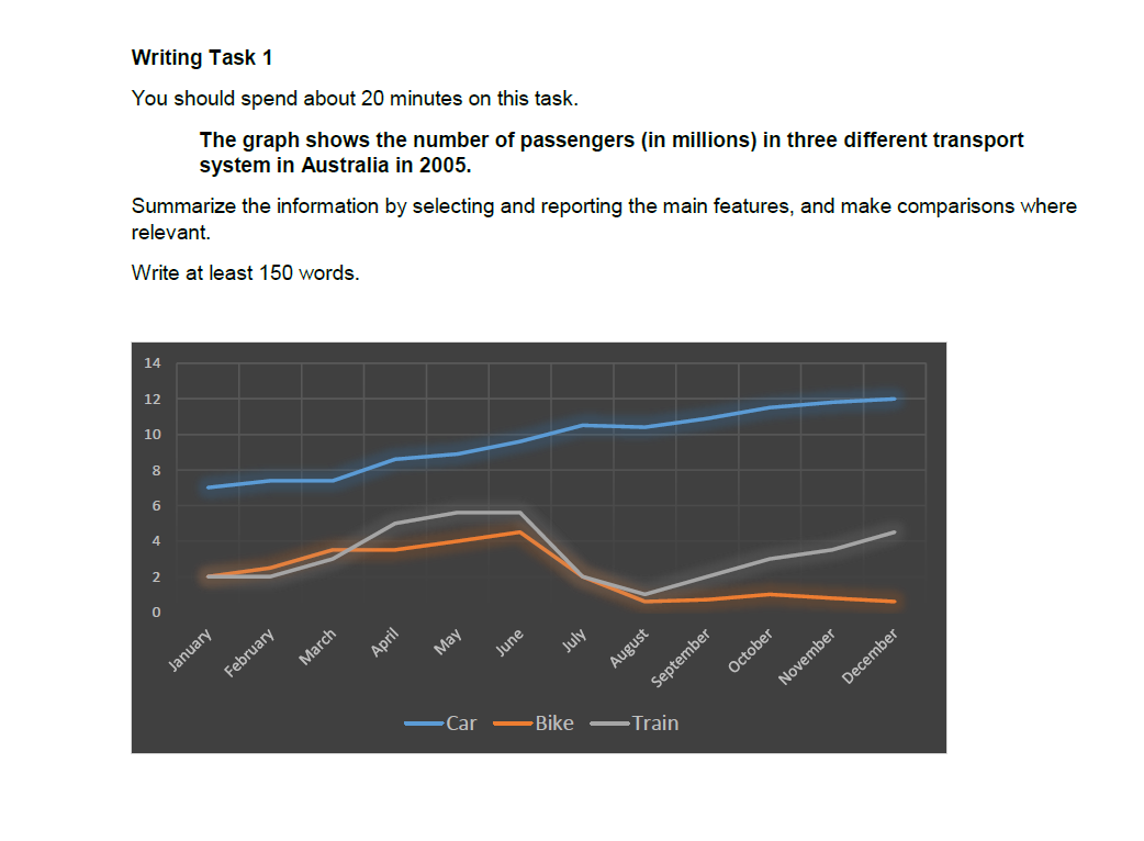
The line chart reveals the number of users in three different transportation methods in Australia in 2005. Overall, there were more car users than users of bike and train during the period.
In January, car users in Australia were at 7 million. This figure was more than three times higher than bike and train users, which gap became even bigger in August when the number of bike and train users dropped. The number of car users continued to increase towards the end of the year, making it the highest all throughout 2005, reaching 12 million.
For bike and train, the numbers fluctuated. Both started from 2 million, and grew to around 6 and 4 in June, respectively. However, in the ensuing months until August, both of them saw a huge drop in passengers to almost 1 million. Then train passengers saw a comeback to 5 million by December, while bike riding users had become less appealing.
(156 Words)
解説
この問題は、線グラフ(Line graph)の問題となっています。
Task 1の問題で一番最初に考えるべきことは、以下の4つのポイントだと思います。
- 何(What):The number of passengers in car, bike and train
- いつ(When):2005
- どこ(Where):Australia
- 単位(Unit):in millions
問題文とグラフから、以上4つの要点を押さえた上で、Introductionの作成に取り掛かります。
Introduction: 上記4つのポイントを押さえた上で、問題文をそのまま写すのではなく、パラフレーズ(言い換え)することが求められます。以下、筆者のintroです。
- 設問の文章:
- The graph shows the number of passengers (in millions) in three different transport system in Australia in 2005.
- 筆者の文章:
- The line chart reveals the number of users in three different transportation methods in Australia in 2005.
- The graph ⇒ The line chart
- shows ⇒ reveals
- the number of passengers ⇒ the number of users
- in three different transport system ⇒ in three different transportation methods
このようなプロセスを踏んでIntroductionを作りました。
Overview: Overviewは、グラフ全体のトレンドを表します。注意すべき点としては、Overviewでは細かい数字を入れることはしません。筆者のOverviewは以下のようなものになりました。
英文: Overall, there were more car users than users of bike and train during the period.
日本語訳:全体として、その期間(2005年)において、自転車や電車よりも車の利用者が多かった。
このように、グラフで最も顕著に表れているポイントをOverviewとして書く事で、グラフの大まかな全体像を伝えることが可能になります。
Body:Bodyでは、グラフのより詳細な情報(数字を含む)を記載していきます。
本文では、CarとBike&Trainでパラグラフを分けています。
Carに関する描写では、基本的に1月~12月にかけて一貫して右肩上がりのグラフとなっています。ですから、一番重要な情報(最小値と最大値)のみ明確にして、その他の情報はトレンドを意識して書きました。
Body 1の最終文を例として挙げてみます☟
The number of car users continued to increase towards the end of the year, making it the highest all throught 2005, reaching 12 million.
車のユーザーは年末にかけて上昇し続け、2005年の最高値である1,200万人に達した。
これは上手くトレンドを表していると思います。一貫して上昇を続け、最後には最高値である1,200万人に達したという文で、文章だけを見てもなんとなくグラフをイメージできるのではないかと思います。
続いて、Bike&Trainについてのパラグラフです。
これはグラフを見ても分かるように、変動が激しいですね。こういう場合は、変動を表す単語「fluctuate」を使います。(fluctuate「変動する」、fluctuation「変動」)このグラフでは、6月まで上昇基調を示したものの、8月にがくっと下げ、それ以降Trainは上昇しましたが、Bikeはほぼ変動がありませんでした。
However, in the ensuing months until August, both of them saw a huge drop in passengers to almost 1 million.
しかしながら、8月までのその後の月には、bikeとtrainの両方とも約100万人までユーザーの急激な減少があった。
Then train passengers saw a comeback to 5 million by December, while bike riding had become less appealing.
電車の乗客は12月までに500万人まで数が戻ったが、自転車ユーザーはあまり変化がなかった。
Body 2では、最初の1月と最後の12月に加えて、急激な変動があった6月と8月の数字を明記しました。
以上が、今回の解説となります。今回のエッセイが、皆さんのTask 1勉強に少しでも参考になれば幸いです。
参考書
今回は手作りの問題を使いましたが、筆者は通常過去問を解きながら学習しています。その中でも、Cambridgeから出ているこのIELTSの過去問集が、最も信頼のおけるリソースだと思います。IELTS16が2021年8月現在で最新版となっています。”with Audio”とタイトルに書いてあれば音声もダウンロードできますので、しっかりとリスニング対策もできます。
最後まで読んで頂きありがとうございました!
ツイッターもやっていますので、是非チェックしてみて下さい^^